
Introduction
Project type
UI, UX Design
Agency
Richard Moore Asscociates
Deliverables
Website (Desktop, mobile), App

Booking window
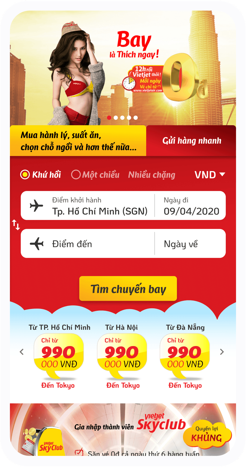
Vietjet old booking window
Vietjet Air's online check-in tab appears active but may confuse users due to numerous information entry fields. The term "special customer" is unclear.

My solution
Combine related information, visualize journeys based on departure and destination points, use icons to support information, and automatically detect location to select the appropriate currency unit.


Booking flow
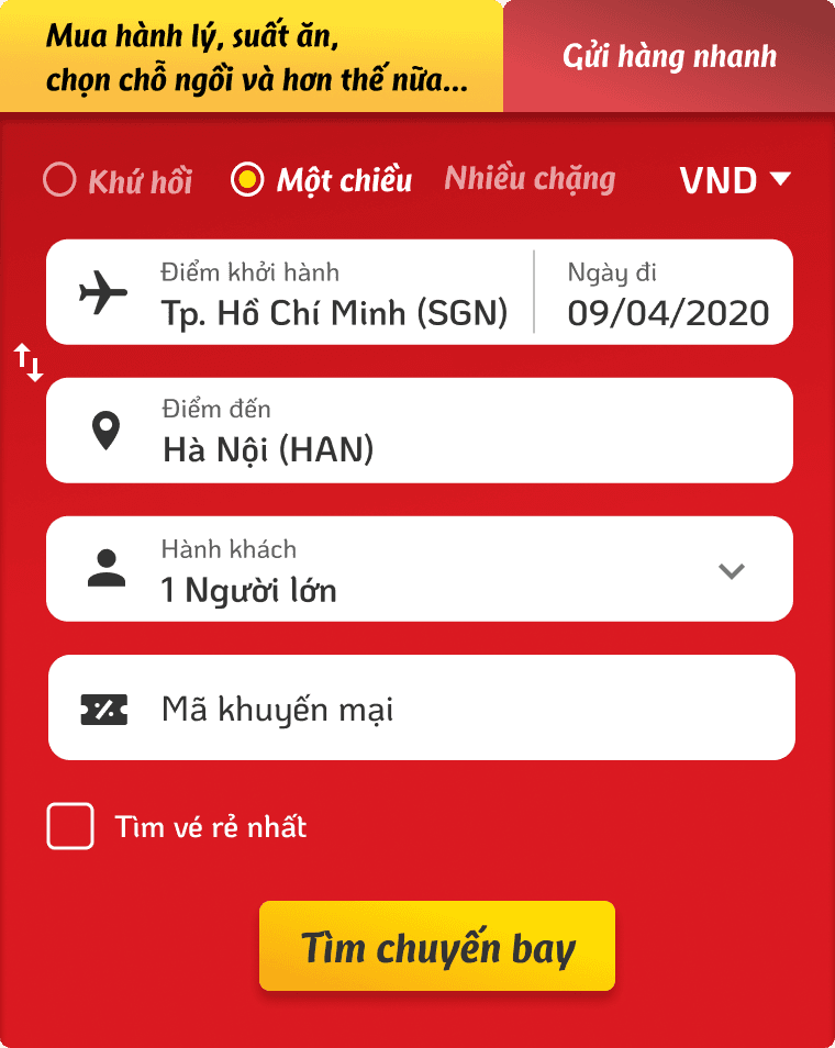
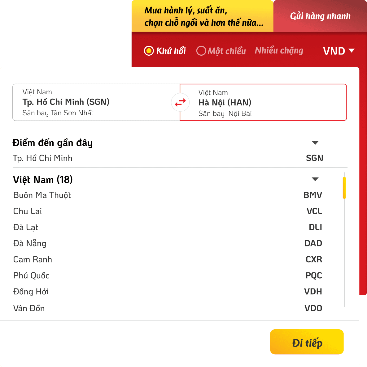
Select a flight
Vietjet Air's ticket booking process involves seven steps and lacks clear price details. The date and time are separated, making it difficult to track, especially for flights that span into the next day. The ticket class selection uses radio buttons, complicating the operation.

Combine related information to simplify the content.
In each step, always provide full flight information to ensure that the customer is sure they are booking the right flight, creating peace of mind
Visualize the ticket, highlight the cheapest ticket
Detailed listing of ticket prices and other surcharges
Customers usually have the demand to hunt for cheap tickets, so show the lowest ticket price 2 days before and after the selected day for easy selection
Have a step to confirm the ticket information before moving on to the next step
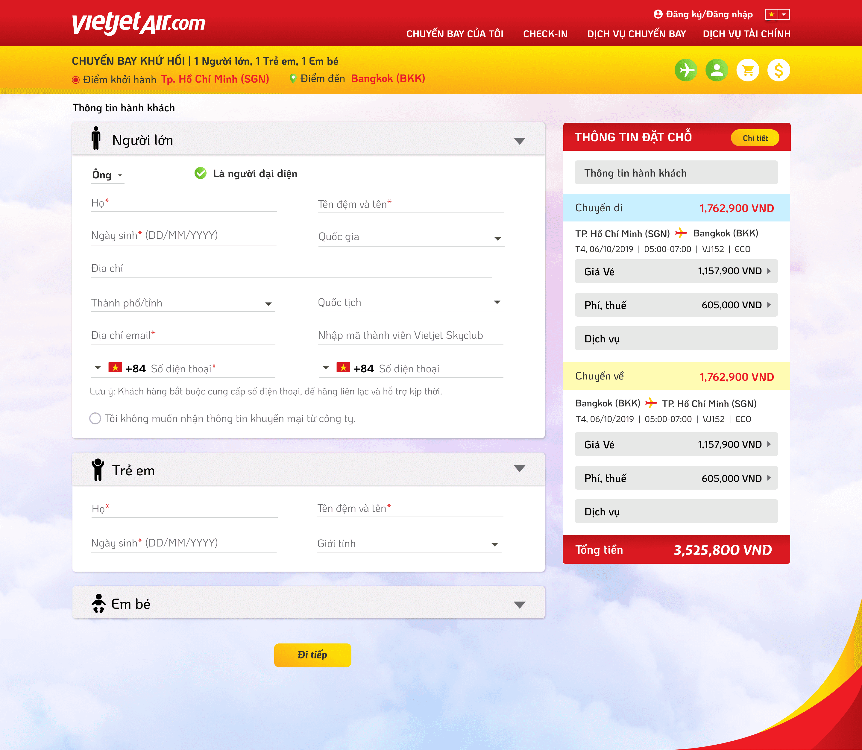
Passenger information
Lack of visual hierarchy
Date of birth field does not display formatting
Excessive unnecessary information

Increase information hierarchy
Eliminate unnecessary fields (consult with operations, legal, and system teams to select essential fields)
Automatically condense passenger information upon completion of input
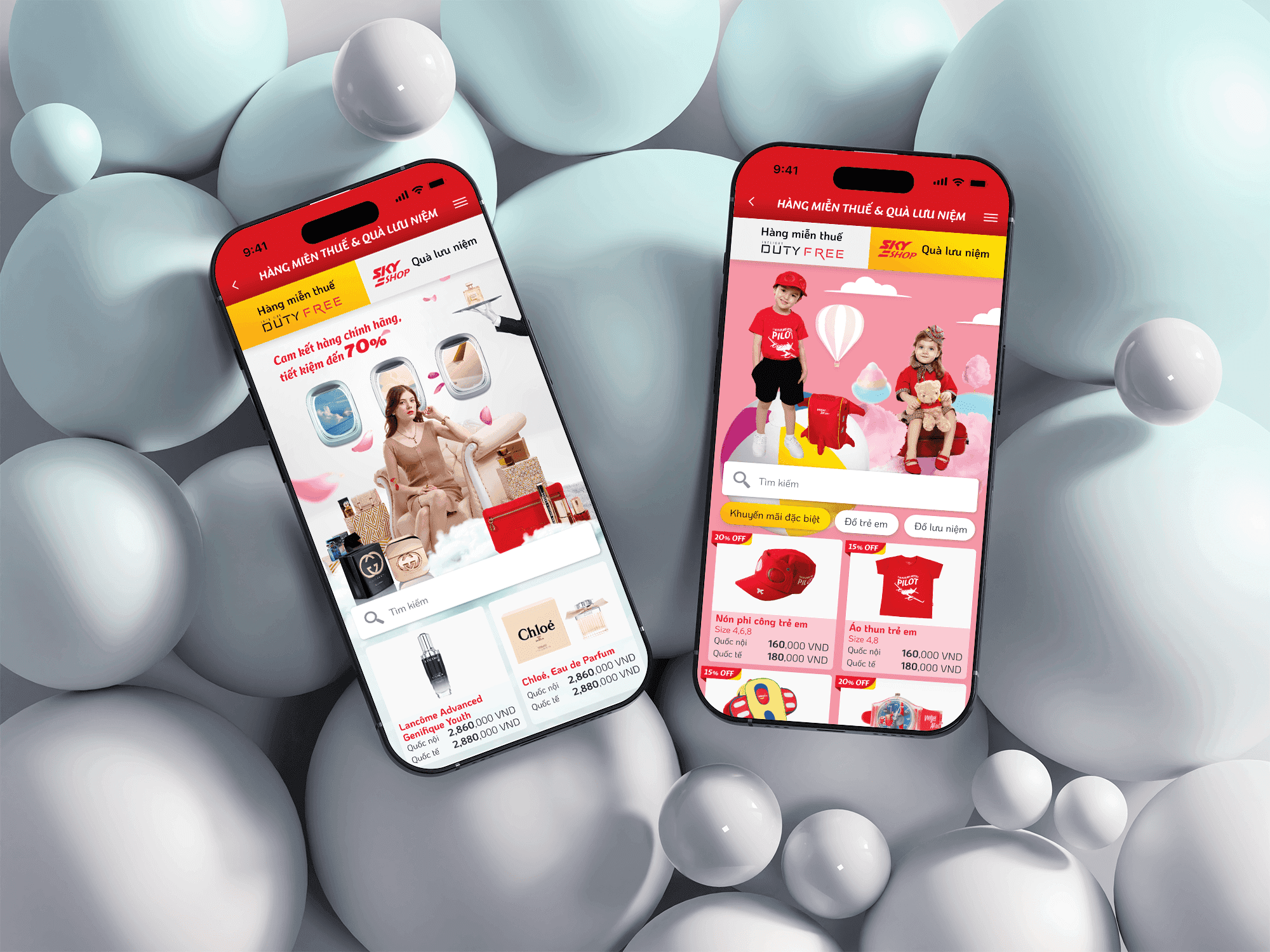
Add-on services

Utilize a listing layout for easy addition of additional services in the future.
Always display transparent pricing information for the selected services.
Add banner sections for convenient promotion programs.


Payment
Lack of visual hierarchy
Date of birth field does not display formatting
Excessive unnecessary information
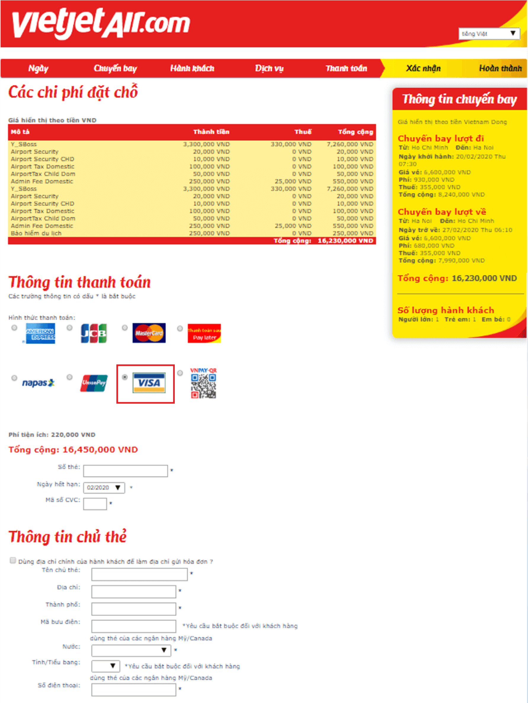
Increase information hierarchy
Eliminate unnecessary fields (consult with operations, legal, and system teams to select essential fields)
Automatically condense passenger information upon completion of input

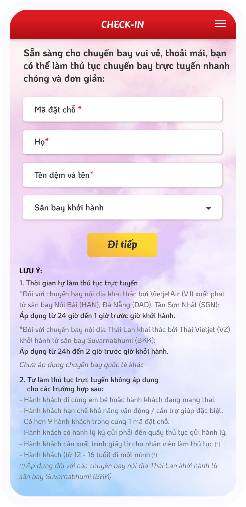
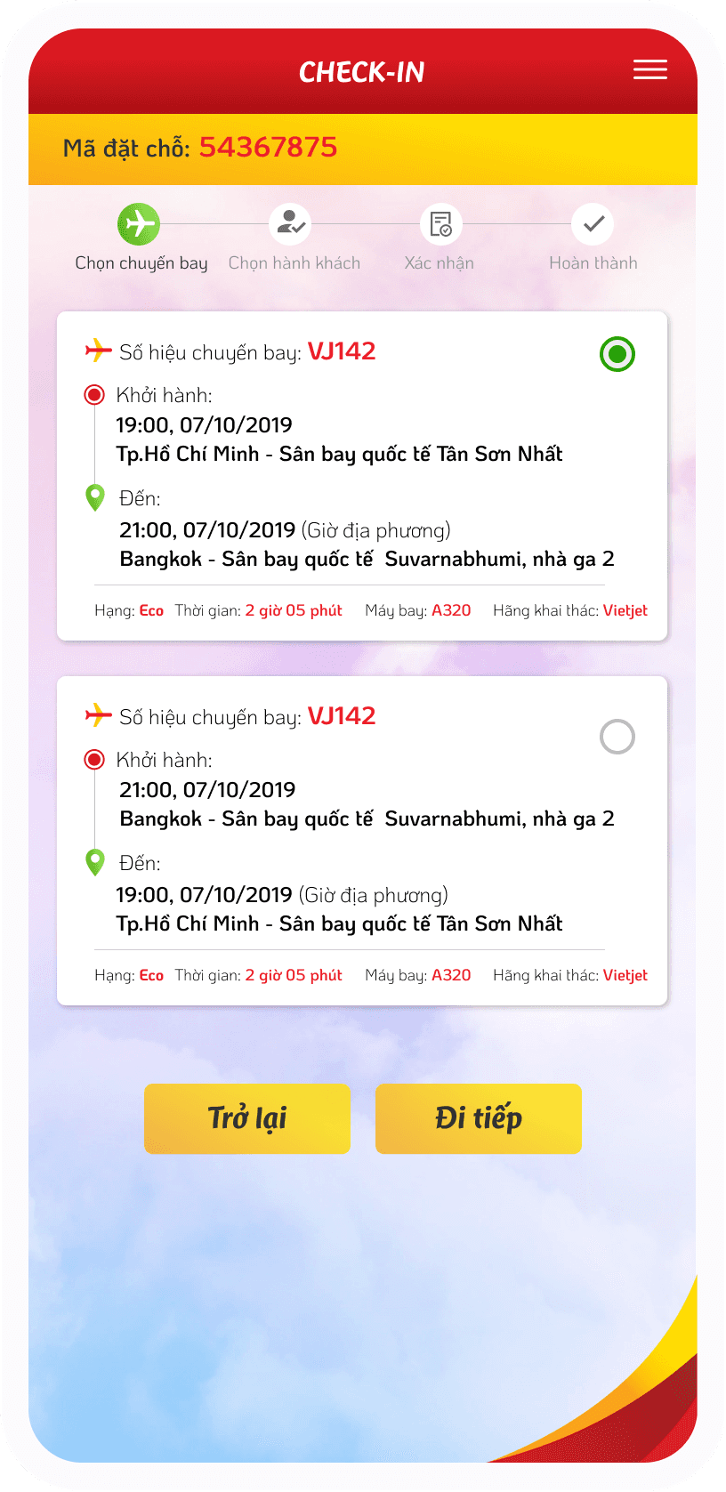
Other function
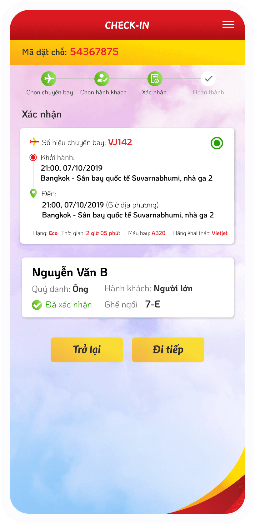
Check-in online


Project notes
Credit
Creative director: Thy Nguyen Huu
Account: Nhat Thanh
UI UX designer: Viet Hiep, Van Thanh
VietjetAir web master: Mr Duy
VietjetAir designer: Ms Khanh
Duration
6 months
Collaborator
VietjetAir Web & Marketing team
Dinosys development team
Most design revision round
Homepage (12 rounds)
What I learned from
this project
Identifying components and building a design system is very important, it will help save a lot of time
Business insight is also very important, understanding how the business operates will help make the design more practical
Knowledge about the system is important, understanding how the system operates, the reasons behind the decisions will help us easily choose a better solution
There is no best solution, only a better one (learned after 12 rounds of homepage editing)