
Introduction
Project type
UI, UX Design
Client
BssGroup
Deliverables
Brand guideline, Webapp
Analyze current design
This is a redesign task. I first analyze the current design to:
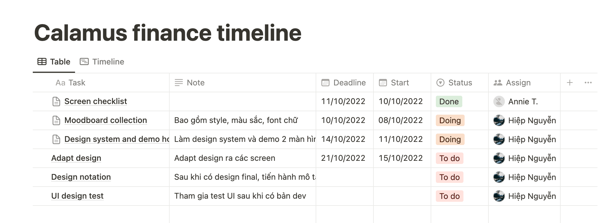
Estimate the timeline
Understand the flow and how the system works to audit the UX and redesign the UI
Define reusable components to build a design system
Using notion to manage and track task (notion support hight res image to review, embed figma and easy to comment)

Building design components


Main dashboard

The dashboard aims to help users quickly get an overview of incoming and outgoing transactions. It's easy to check streams within a certain period of time. However, the current dashboard has not yet achieved this goal.
There is no active status to know which content tab you are on
The chart cannot show the correlation between different types of transactions
Related information areas are being scattered in many places (Incoming and outgoing streams)
The buttons do not give a call to action feel
Users lack the feeling that they can master the features of the product
My solution

Add title, active status of the menu
Separate 2 contents into incoming and outgoing stream for easy tracking and understanding by the user
Use donut chart for easy overview of transactions
Stream value is shown according to the work week
Highlight call to action button, the menu is redesigned to be more modern
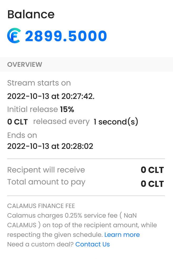
Create new stream
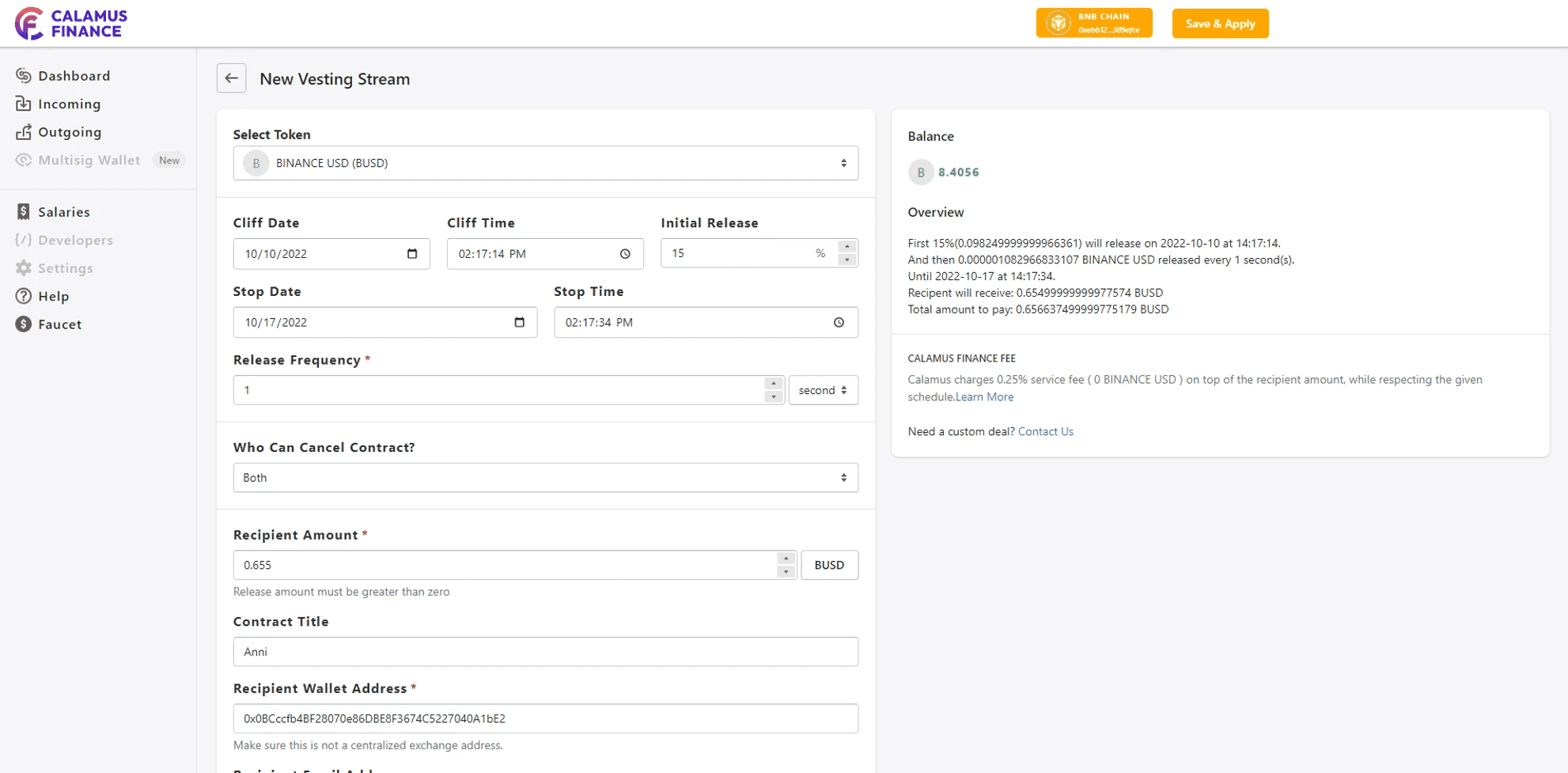
Calamus Finance by default has 2 features: New Vesting and new stream. In essence, they are almost equivalent. After discussing with the product management team, we decided to merge these 2 features to make it convenient for users and avoid confusion.
The design of the form is not optimized in terms of layout
Too many mandatory fields to fill, making it difficult for users to use
If you are a new user, the copy part is hard to understand
The information hierarchy is not good
My solution

Redesign the modern overview section, better categorize the information
Group related main contents so that users can create a stream quickly
Visualize information by adding more icons
Incoming/outgoing dashboard
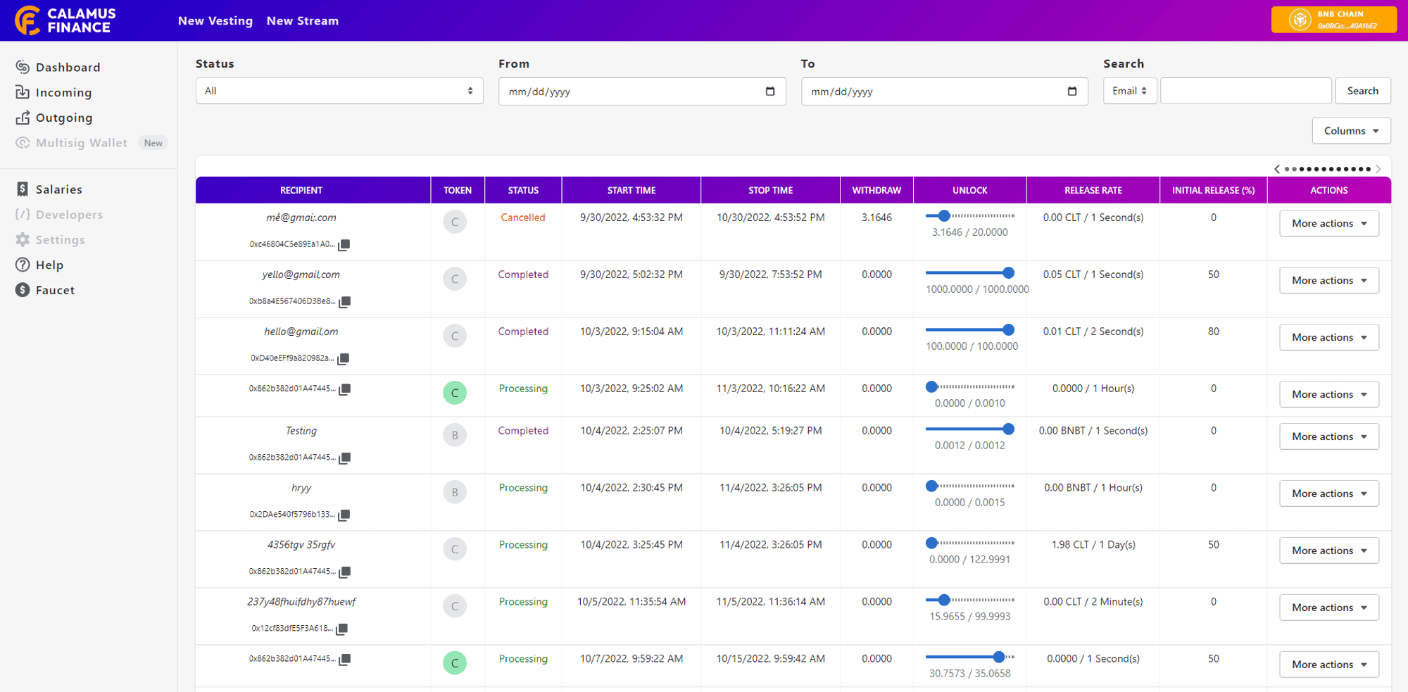
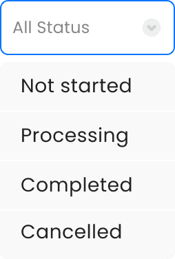
The search tool is hard to use (size, flow, button), not meeting the user's needs
The information table is hard to follow (Order of information, layout of the table, information hierarchy)
My solution
Redesign the search feature to meet user needs (search by title, filter by status)
Reorganize information for easier tracking
Condense layout and content so users don't feel overwhelmed by a large amount of information
Load more button has the remaining number of streams, making it easier for users to track
Allow users to customize the table according to their needs


Other screen

Project notes
Credit
Project manager: Jacob Duong, Annie Tran
Designer: Hiep Nguyen
Duration
3 weeks